Small Rooms Don’t Need Small Furniture—And 9 Other Surprising Design Truths -

PHOTOGRAPHY BY KIMBERLY MURRAY; DESIGN BY FORBES MASTERS
We all gravitate toward design TV shows because there’s something utterly satisfying about seeing a home makeover completed in a matter of 30 minutes. But in that span of time—commercial breaks included—there’s a lot of information that gets lost. We start to believe that a kitchen renovation only takes two days. We’re told it’s expensive to fix a faulty foundation but never find out how much it actually costs. This lack of transparency ultimately inspired Tavia Forbes and Monet Masters, the designers who make up Atlanta-based firm Forbes Masters, to start posting design facts on their Instagram feed. The short, informative blurbs take the guesswork out of things like budgeting and planning. “No one’s really talking about the details and how we, designers, create these beautiful rooms,” says Masters. In the spirit of setting realistic expectations, we asked the duo to expose 10 little-known design truths.
Most Projects Average Three to Six Months
And that’s not including renovations. When Forbes and Masters set about transforming a room, they dedicate two to four weeks just to researching pieces and placing orders. “We write off another three weeks for waiting to receive all those items,” says Forbes. But be prepared to hold out for longer: A custom sofa can have a lead time as long as 12 weeks.
A Budget for One Room Shouldn’t Spread to Other Spaces
“Attack your projects in phases,” explains Forbes. When you allocate your budget to making small tweaks to various rooms, you never end up with a finished, cohesive space that makes you feel good every time you walk in.
Quality Products, Fast Turnaround, Low Cost—You Can Only Have Two
Try as you might, you can never accomplish all three. The designers have found that most clients are willing to compromise on the timeline in order to get quality goods at a lower cost. But when you do want to go the fast and cheap route, that’s when they suggest turning to a big-box retailer like IKEA.
Small Rooms Don’t Need Small Furniture
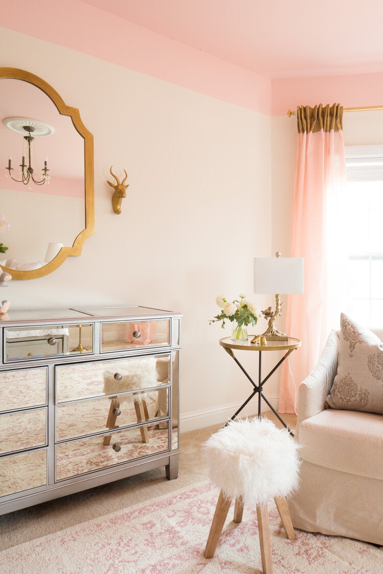
Less is more, right? Not necessarily. Filling a tiny room with tiny furniture or leaving the floors bare in an effort to create the illusion of square footage actually shrinks the space. “Then there’s the assumption that the sofa has to go up against a wall,” says Masters. “It’s okay to let it float—it will emphasize the space around it.”
Always Paint the Trim
When working with a saturated wall color (think: a punchy teal or rich emerald), the pair takes the color up to the trim and down to the baseboards. “You’re not going to achieve the impact you want with boring white moldings,” says Forbes.
Your Upper Cabinets Don’t Have to Match the Lowers
It’s intuitive to copy the footprint of your lower cabinets when mapping out the upper cupboards, especially as you get closer to your range. But think of the hood as an accessory in the room. “It needs breathing room,” says Forbes. You also don’t have to have the same countertop material everywhere (switch it up on the island or breakfast bar).
Mix Up Your Lighting
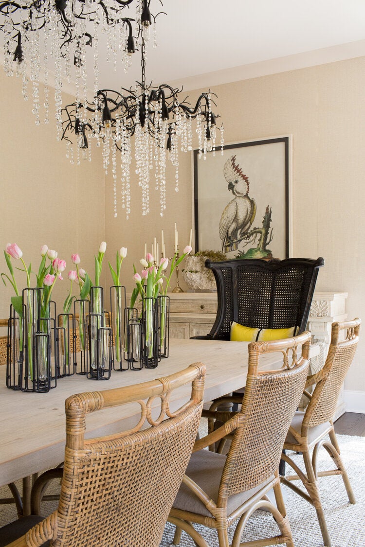
Filling a space with different types of lighting, from wall sconces to picture lights, creates ambience (and so does putting the bulbs on a dimmer). When it comes to larger fixtures like chandeliers, select the correct diameter by adding the length and the width of the room. Then, convert the answer to inches.
Streamline Appliance Finishes
If you want to love your appliances for a long time, steer clear of trendy copper finishes and bright colors. “Don’t get too creative unless you’re the type of person who likes to redesign your space every five years,” says Forbes.
Scrap the Medicine Cabinet
Replace your builder-grade sheet mirror or dingy medicine cabinet with something vintage. “Switching it out is a really easy way to create drama in a bathroom,” says Forbes. Complete it by mounting sconces on either side or hanging a drop-down pendant light.
Layer Window Treatments
Plain white blinds get the job done, but going the extra mile with your drapery pays off. The designers are big fans of IKEA’s velvet curtains (with the grommet cut off). Then they add a lining to fluff them up a bit and make them stand out.


No comments:
Post a Comment